Small Call to Action Headline
Podcast

Igniting Curiosity: Crafting Stoke + Season, Where Fire and Food Unite
The Challenge
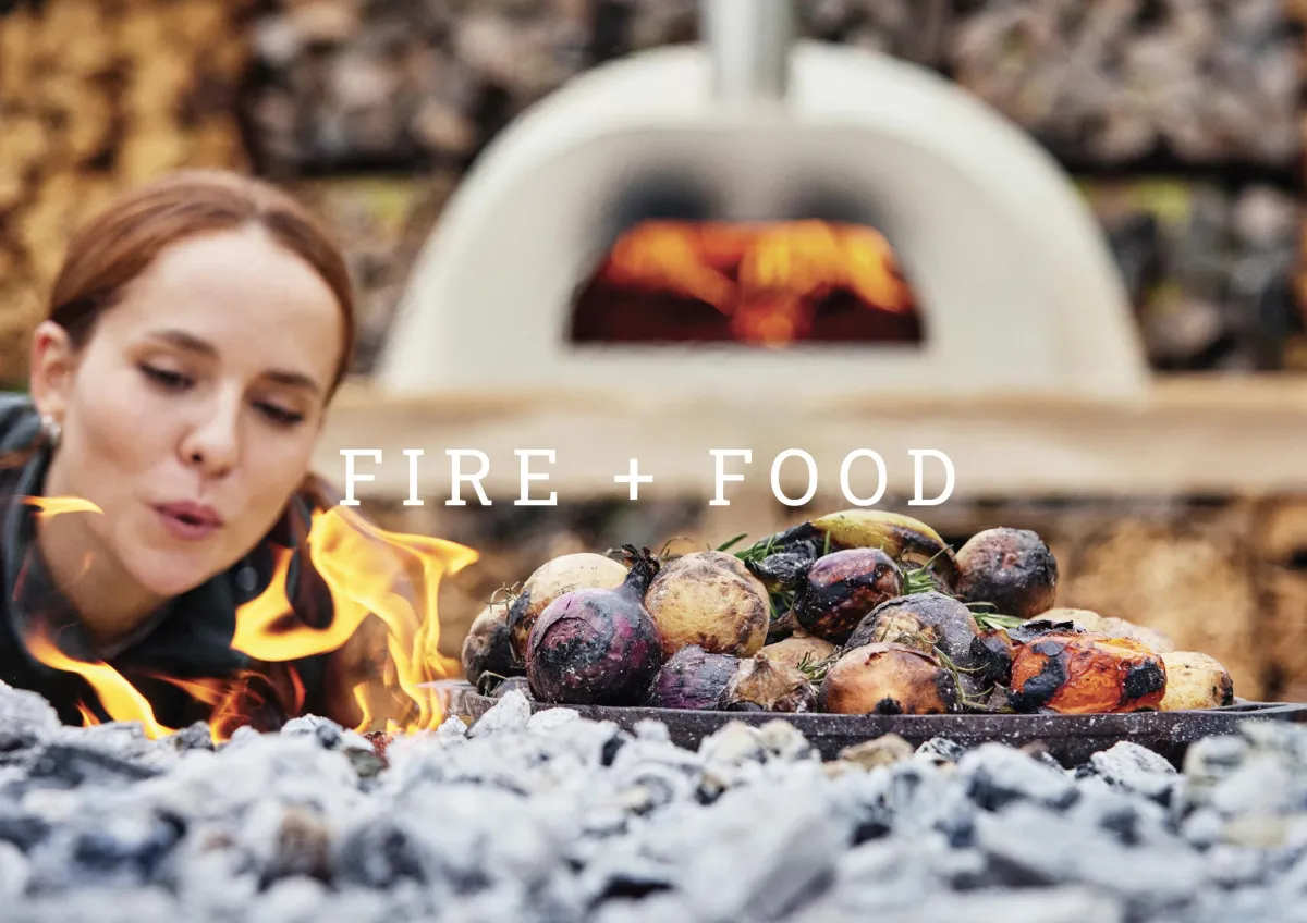
Amidst a growing landscape of corporate team-building offerings, the new brand needed to look elegant and stylish, and appeal to a more discerning, adventurous and curious corporate customer. The offering is simple, it’s all about fire + food. Our mission's core was to develop a strong brand name, a visually stunning look, and a captivating online presence. These things were crucial to kick-starting the brand and resonating with its spirit of building connections and getting back to nature's raw charm through the art of outdoor cooking.
The Solution
Strong & Together embarked on comprehensive branding exploration, prioritising the definition of brand values, the creation of a distinctive name, and the development of a unique visual identity. At the centre of our identity sits our logo, crafted from the leading SS's in the brand name, symbolising sophistication intertwined with the primal allure of flame and flavour. Beyond the logo, elements such as colour palette, typography, imagery, and tone of voice were meticulously curated to enrich the brand's depth. Additionally, our brand creation extended to crucial touch-points like website design and a curated bank of Instagram posts.
Solid foundations
Founders Christian and Clare envisioned an unforgettable outdoor culinary adventure, coupled with a profound impact on their customers. Strong & Together was tasked with delving deep into their vision, unearthing the essence of their brand, and translating it into a memorable identity.
During a site visit, we marvelled at the inviting setting for these outdoor cooking experiences. Subsequently, in a kick-off workshop with Christian and Clare, we delved into discussions, explorations, and the uncovering of the brand’s foundational values—it’s grounded, fosters connections with nature, people, and the elemental fusion of fire and food, while igniting curiosity and primal desire.
Our challenge was to name and craft an identity that exudes elegance and style, resonating with discerning, adventurous, and curious corporate clientele.
The Naming Process
In the quest for the perfect name, Strong & Together embarked on an extensive exploration, delving into an abundance of options—from familiar words to Latin terms, from invented neologisms to acronyms. Presenting a curated shortlist of twelve names, each accompanied by suggested creative executions, we meticulously adhered to the project brief. Narrowing down the selection to a final trio, the ultimate choice emerged: Stoke + Season.
This name serves as a direct homage to the core elements of fire and food, with elegant simplicity. “Stoke” invokes the primal act of kindling a fire, evoking a sense of raw instinct, while “Season” carries a dual significance—it alludes to both the act of seasoning food and pays homage to the natural cycle of the seasons, a crucial narrative thread within the
brand’s story emphasising the use of seasonal produce. The alliterative quality of the name adds to its memorability, ensuring Stoke + Season stands out effortlessly.
The Identity
The Stoke + Season name emerged as the embodiment of the ethos—a harmonious blend where fire and food seamlessly intertwine. Capturing this essence in the brand identity was paramount.
The sleek and singular flame logo – is enhanced by sophisticated typography and a considered colour palette; our brand identity radiates refinement and allure, captivating discerning, adventurous, and curious corporate clientele.
Derived from our master brand logo, Stoke + Season brand icons serve as visual embellishments, elevating our brand presence and establishing a distinct visual language across various touch points. Each icon—meat, fish, and vegetables—is well crafted, reinforcing our brand identity, and inviting enthusiasts to savour the fusion of culinary prowess and adventure.
Setting the Tone for Success
Christian and Clare harbour grand ambitions for the Stoke + Season brand. They recognise that investing in a robust strategic framework and impeccably crafted brand identity from the outset is a pivotal investment with enduring dividends.
However, maintaining consistency is paramount to cultivating brand loyalty and trust. To uphold this standard, Strong & Together meticulously crafted comprehensive brand guidelines encompassing the logo suite and its applications, brand fonts and their usage, a carefully curated colour palette, distinctive icons, photography directives, and a defined tone of voice.
These guidelines serve as the cornerstone of the brand’s integrity, ensuring coherence and resonance across all touch points. Furthermore, as the brand matures and adapts, these guidelines will evolve, ensuring Stoke + Season remains both on target and current.
But what do Christian and Clare think?
“Clare Sheffield and her team have helped us enormously with the development of our new business Stoke + Season from it’s inception.
They’ve been genuine brand partners, helping us define and nail down our identity, not just in terms of our name and logo but the whole look, feel and tone of voice running across our website and Instagram channel.
It’s been particularly valuable to work with them consistently from the strategy stage onwards.
Clare and Emma clearly have extensive experience in the brand space and can turn their hands to most things. The volume of creative thinking and options presented has been impressive throughout, we are happy to have found them!”
Clare Woolfenden, Stoke + Season Founding Partner
Click Here to talk us about the ways in which we can use strategy, creativity and technology to positively elevate your brand.
Strong & Together, your design partner
Branding experts to ambitious business owners since 2010.
© Copyright S&T Design Limited 2020. View our privacy policy.
Peake House, Newtown Road, Newbury, Berkshire, RG14

