Small Call to Action Headline
Podcast
Refreshing HotTea Mama: A Journey of Brand Evolution and Packaging Revitalisation
Embark on the journey of HotTea Mama, a nurturing tea brand dedicated to supporting women through every stage of life. Collaborating with Strong & Together, founders Bethan Thomas and Kate Achilles sought to reinvigorate their brand identity and packaging to better reflect their mission of wellness for women. In the face of a competitive market, HotTea Mama aimed to amplify its uniqueness and emotional resonance. This case study unveils the meticulous process behind the brand's rejuvenation, highlighting the strategic redefinition of identity and packaging, ultimately positioning HotTea Mama to scale and thrive in the market.
The Challenge
HotTea Mama was founded by Bethan and Kate with a clear passion: to support pregnant women and new mums with a range of specifically blended teas. As the business grew, they aimed to extend this support to women at all stages of life through a wider product range. However, they needed a clear value proposition to unify their offerings. The existing logo and packaging no longer encapsulated the diversity and breadth of the product range. This made it difficult for customers to differentiate between products, and the high quality of the teas was not being effectively communicated. To maintain its competitive edge and continue to grow, HotTea Mama needed to evolve its brand identity and packaging to reflect its broader mission and enhance its market presence.
The Solution
Partnering closely with HotTea Mama founders Bethan Thomas and Kate Achilles, Strong & Together undertook a transformative journey to redefine the brand. Together, we refined the brand proposition and revitalised both the brand identity and packaging, placing a strong emphasis on the brand's core values and product differentiation. HotTea Mama, renowned for its expertly blended teas that support women through all stages of life, needed a distinctive and confident product range.
We listened to their vision and recognised the need for a bold and well-differentiated product lineup. The resulting 'In Wellness For Women' proposition became the cornerstone of our creative process. The updated logo now represents women at all stages of life, beyond just pregnancy. This evolution extended into the packaging, where our team crafted designs with striking shelf presence. These efforts not only highlighted the premium quality of HotTea Mama's teas but also facilitated increased product listings, enhancing the brand's mission and impact in a competitive market.
In Wellness For Women
HotTea Mama was founded by Bethan and Kate, inspired by their personal journeys through fertility struggles, pregnancies, and parenthood. Bethan, a pioneering Tea Scientist with extensive industry experience, leads the UK team, while Kate, a former professional ballerina turned marketeer, heads the Australian team. Both founders recognised the importance of strengthening the brand proposition, identity, and packaging to support further scaling.
To define the brand proposition, we held a collaborative workshop with Bethan, Kate and the team. The outcome, ‘In Wellness For Women,’ perfectly encapsulates their mission to support women through all life stages with delicious and thoughtfully blended teas. From PMS to pregnancy, parenthood to perimenopause, HotTea Mama’s teas are crafted to meet the unique needs of women, reinforcing their commitment to wellness and empowerment.
The Identity

HotTea Mama’s brand identity was well-established and appreciated, but as the product range expanded from teas and herbal infusions for pregnancy and motherhood to those supporting all stages of women’s lives, the pregnant lady in the steam logo no longer fully captured the brand proposition.
To better reflect this broader mission, we crafted a new steam silhouette featuring a female figure rather than a pregnant one. This visually simple yet impactful evolution effectively expresses the new brand proposition.
We developed a suite of logos for use in various formats and scales, ensuring consistent and versatile brand representation.
The Packaging

The packaging underwent an innovative redesign aligned with Bethan and Kate's vision for commanding shelf presence and enhancing product distinctiveness, all while highlighting the 'In Wellness for Women' proposition.
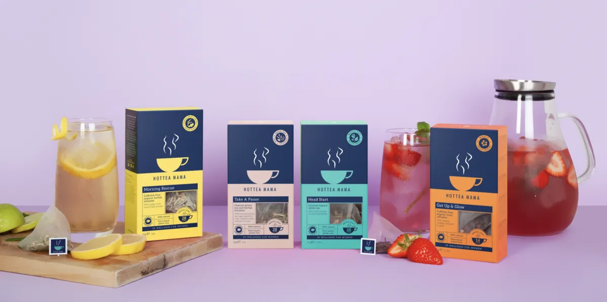
The shift from a cubic form to a taller, slimmer box not only optimised shelf space but also incorporated a window, effectively showcasing the premium quality of the whole-leaf teas. Introducing a split-pack design created a horizon line, enhancing the visual impact with the brand's cup logo prominently displayed.
Maintaining consistency, the brand's navy-blue hue adorned the upper portion of the pack, while vibrant and striking colours defined each product variant in the lower section, facilitating clear differentiation within the product range.
Leveraging their dynamic colour palette for new offerings, the packaging employed infographic roundels and a user-friendly chart to convey essential product information, ensuring clarity amidst a wealth of details. Additionally, the back of the pack accommodated extensive multilingual content.
Ultimately, this redesign encapsulates their mission of 'In Wellness for Women,' delivering exceptional shelf presence and enhancing the shopping experience through easy-to-navigate packaging, all while emphasising the brand's dedication to women's wellness.
Project Success

The HotTea Mama strategic brand and packaging overhaul has provided them with a competitive edge in the market. With enhanced shelf presence and a clear message of 'In Wellness for Women' embedded within their packaging, HotTea Mama has resonated strongly with consumers and retailers alike.
This increased visibility has not only bolstered their presence on shelves but has also attracted new partnerships and opportunities for expansion. As they continue to grow from strength to strength, it's evident that their investment in the brand proposition, identity and packaging design has been a pivotal factor in their ongoing success story.

“I'm thrilled to express my delight with Clare Sheffield and the Strong & Together team for their exceptional work on our HotTea Mama rebranding project.
Their creativity and meticulous attention to detail surpassed our expectations, resulting in a rebrand that has been enthusiastically embraced by wholesalers and customers alike. The enhanced shelf presence has driven increased listings, setting the stage for exciting times ahead for HotTea Mama.
Working with Strong & Together was a pleasure, and we wholeheartedly recommend them for any branding projects.”
Bethan Thomas, Co-Founder HotTea Mama
Click Here to talk us about the ways in which we can use strategy, creativity and technology to positively elevate your brand.

Strong & Together, your design partner
Branding experts to ambitious business owners since 2010.
© Copyright S&T Design Limited 2020. View our privacy policy.
Peake House, Newtown Road, Newbury, Berkshire, RG14